| Font Name | Frutiger Font Family |
|---|---|
| Author Name | Adrian Frutiger |
| Category | Sans-Serif |
| License | Commercial License Required |
| Release Date | 1975 |
| Languages Supported | Multi-Language Support |
The Frutiger Font Family is a highly regarded sans-serif typeface designed by renowned Swiss type designer Adrian Frutiger in 1975. Known for its clarity and legibility, the Frutiger font family has become a staple in both print and digital design. This modern yet classic font is widely used in signage, corporate branding, and user interface designs, offering a balance of professional aesthetics and functional design.
Key Features of Frutiger Font:
- Clear and Legible: One of the primary strengths of the Frutiger font is its exceptional readability, even at small sizes. This makes it ideal for signage and other applications requiring clarity from a distance.
- Timeless Design: The font’s modern, clean lines give it a timeless appeal, making it suitable for both contemporary and traditional projects.
- Extensive Weight Range: The Frutiger family offers a broad range of weights and styles, from light to ultra-bold, ensuring versatility across various design needs.
- Multi-Platform Compatibility: Frutiger is highly compatible across print and digital platforms, making it a favorite for web design, corporate identity, and public signage.
Uses of Frutiger Font:
The Frutiger Font Family is widely used in diverse design applications:
- Signage and Wayfinding: Its clarity and readability make it the perfect choice for airport signs, road signage, and other public wayfinding systems.
- Corporate Branding: Many brands prefer Frutiger for its professional appearance and flexibility, making it a great option for logos, letterheads, and other corporate materials.
- Web and App Design: With its clean lines and legibility, Frutiger works well in user interface (UI) and user experience (UX) design for websites and mobile applications.
- Editorial and Print Design: It is also commonly used in books, magazines, and brochures for its sharp, easy-to-read qualities.
Alternative to Frutiger Font:
For those seeking alternatives to the Frutiger font, consider these similar fonts:
- Helvetica: Another classic sans-serif, Helvetica offers a similar clean and modern aesthetic, with wide usage in corporate and editorial design.
- Avenir: Designed by Adrian Frutiger himself, Avenir offers a more geometric take while maintaining the clarity of Frutiger.
- Univers: Also created by Frutiger, Univers is another versatile font family, ideal for those looking for slight variations in style and weight.
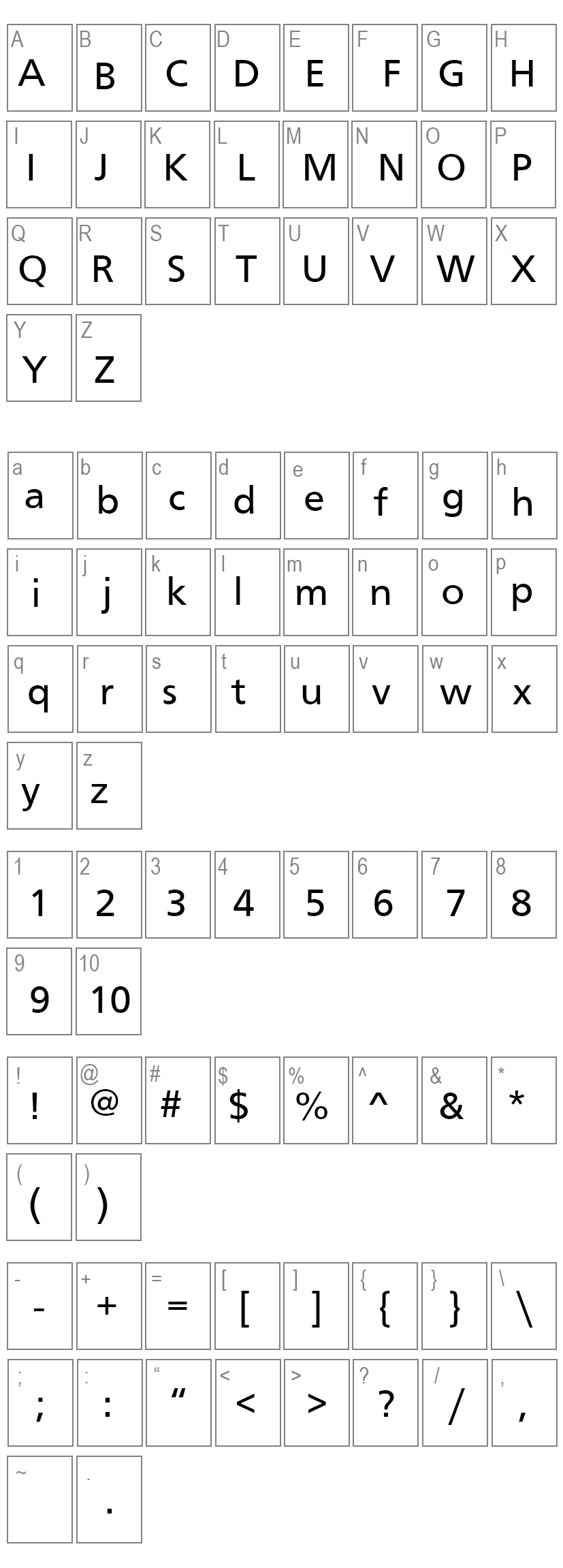
Character Map:
License:
Free For Personal Use
Variants
Frutiger
Frutiger Bold